A review of enhancements to the Remove Driver account management flow on the Online Services platform
Background
Online Services is where Co-operators customers can sign in and manage their insurance policies and investment accounts digitally, either online or through the app.

Starting in 2022, the entire platform was redesigned from the ground up. I led content design for the project, which utilized the newly launched Oak Design System’s library of fully coded and responsive components.
Problem
The large majority of users who launched the Remove Driver flow never completed it. Before we could begin solutioning, the Design and Experience team set out to uncover what was causing the high abandon rate.
Research findings
Synthesized user testing and survey data helped us uncover 3 key pain points.
Low user confidence at the outset of the flow
Overly generic labels for hyper specific tasks
Unclear messaging at critical points in the journey
We found that users weren’t able to predict the policy changes that would result from the Remove Driver flow – and with good reason.
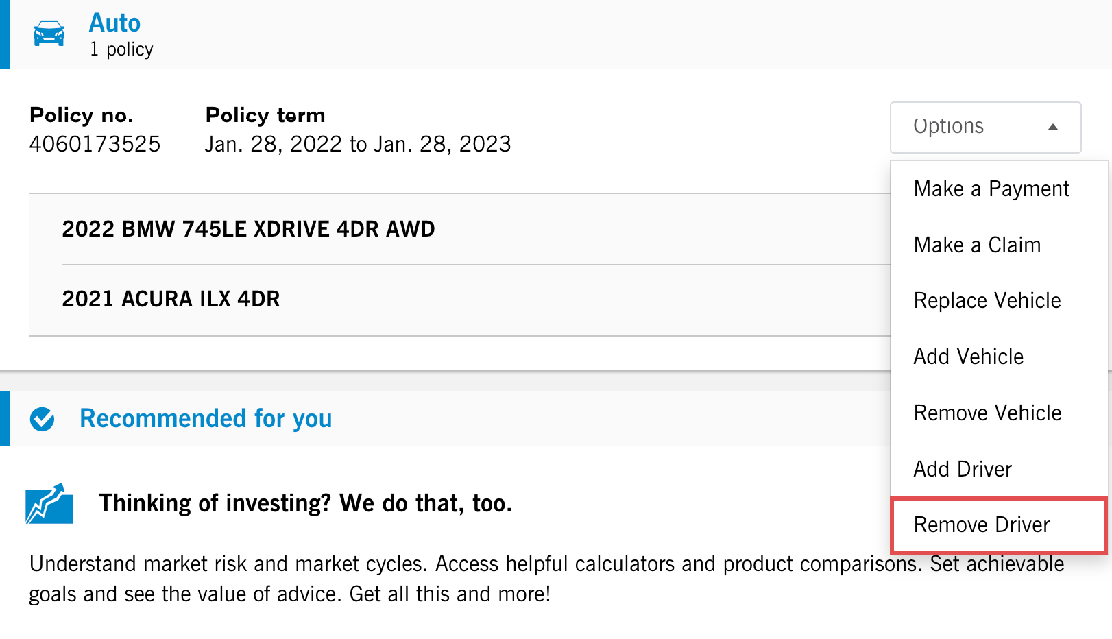
Remove Driver was a single dropdown option from the accounts landing page, but it was 2 separate flows:
- Temporary flow for changes that would eventually be reverted
- Permanent flow for drivers who no longer needed to be insured under the policy
Temporary flow
What wasn’t immediately obvious to users – or to the UX team – was that the temporary flow had very specific business rules tied to it.
These weren’t uncovered until I mapped out the qualifying questions and consulted with the subject matter expert (SME). Through discovery, I began to understand what happened to a user’s auto policy when they completed the temporary flow.
I found that a user could temporarily remove a driver only for children who moved away for college or university – not for reasons like chronic illnesses, injuries or long-term travel. And yet the labels “Remove Driver” and “Manage Drivers” didn’t convey this specific use case at any point during the flow.

Permanent flow
Similar restrictions applied to the permanent flow. It started with qualifying questions like, “Does this driver live with you?” If the user answered “yes,” they were immediately kicked out and left to wonder why.
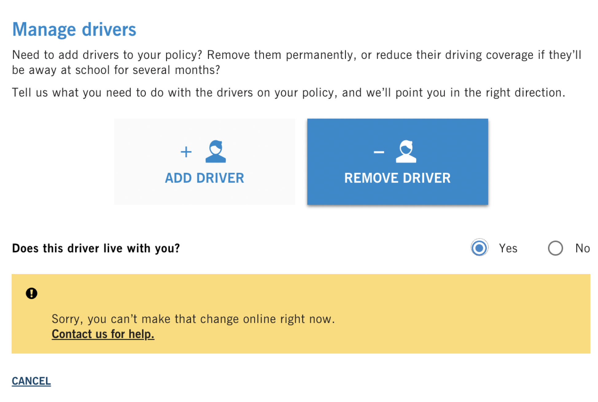
Through consultations with the SME, I discovered that the business rule was in place so that anyone living in the home was insured and paying premiums accordingly. But what if the other driver still lived at the policyholder’s address but had purchased their own insurance, either through Co-operators or a competitor?
Overly restrictive business rules meant that the flow wasn’t serving a large portion of users. Instead, they’d have to call in to speak to a financial representative.
Solutions
We surfaced features at sign-in
We wanted to make it easier for users to predict the policy outcome for the Remove Driver flow. To do this, we had to start with the accounts landing page.
We separated the temporary and permanent flows into 2 separate options and surfaced each with a descriptive and meaningful label.

What’s in a name?
Choosing the right button labels was a challenge in itself. I led content brainstorms to identify all possible labels and the pros and cons of each, then selected 2 A/B contenders for a survey of 40 users.
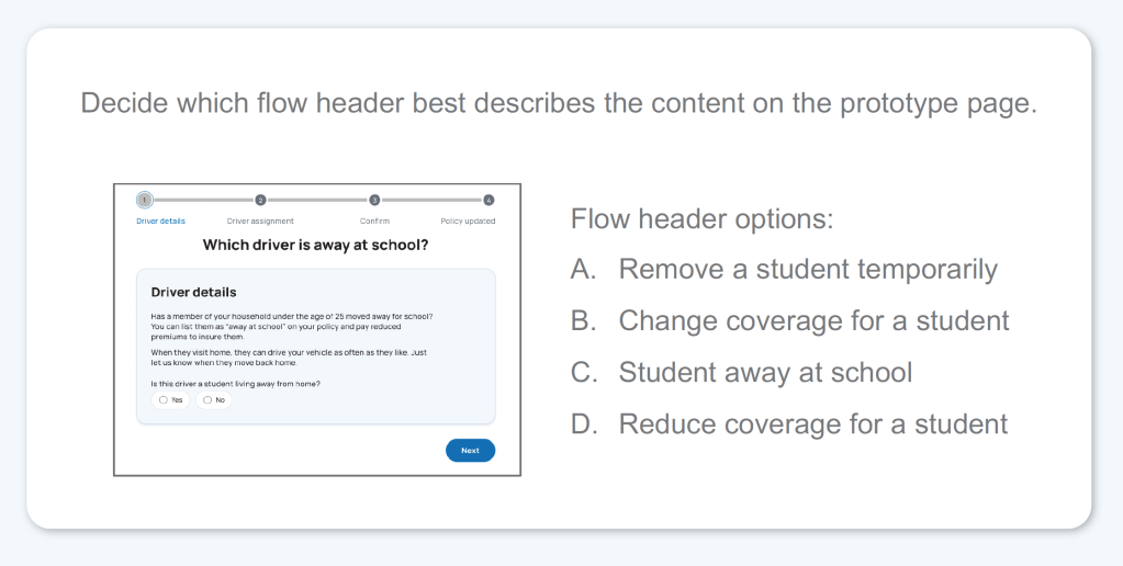
We also presented various flow headers for both button labels to ensure the labels were consistent throughout the entire journey.
Content patterns across the platform used action-oriented terms like “add” and “remove.” But when it came to the temporary flow, that pattern just added confusion.
Label contenders like “remove,” “change” and “reduce” decreased user confidence. Instead, users preferred the button label “Student” and the flow header “Student away at school.”
We made business rules more user-centric
To allow more users to complete the permanent flow, we changed the business rules. Rather than kick out users who indicate the driver still lives at the same address, we added a follow-up qualifying question: “Does this driver have their own auto insurance?”

If the user indicates that the driver is insured, they can still move forward with the removal.
And if they don’t? I knew that the alert messaging needed to be as clear as possible. But the product team didn’t want users to change their responses and provide inaccurate information just to move ahead with the flow.
We landed somewhere in the middle between giving away the magic combination and giving the user clarity.
The result
From the accounts landing page, a user can launch either the permanent or temporary remove driver flow. Both use clear, meaningful and unique labels that help the user better predict the policy outcome before launching the flow.
Review the following screens for a full look at the 4-step temporary flow, “Student away at school.”